Anijah Mclaurin


San Francisco–based designer specializing in print, web, and publication design.
I’m Anijah McLaurin, a San Francisco-based designer studying Design (with a Media Studies minor) at the University of San Francisco. With a love of print, web, and publication design. I find inspiration in cultural archives, community media, and music projects where design plays a crucial role in illuminating complex histories and making art more accessible. My aspirations are to create inclusive, research-driven publications that resonate with readers and websites that users genuinely value. Whether it’s a print series, a publication, or a small web experience, my ultimate goal is to achieve a clear design voice that empowers audiences to feel informed, engaged, and seen.

Accordion Book - Stussy cover
SPRING - 2023
ACCORDION BOOK- 3 x 4.5 inches each (18 PAGES)
ADOBE INDESIGN, ADOBE IllUSTRATOR, ADOBE PHOTOSHOP
The Stussy Cover is an accordion book that traces the style of Shawn Stussy, a fashion designer who is known for his streetwear style. The book was designed to display standing up or to be read like a leporello zine. It turns Stussy’s evolution into something you can flip through, study, and feel.
Shawn Stüssy began as a Laguna Beach surfboard shaper in the late ’70s, turning his bold hand-scrawled signature into a logo that bridged surf culture with the emerging languages of skate, punk. In 1984 he formalized the label with Frank Sinatra Jr., and by the early ’90s—with a SoHo flagship and a growing creative “tribe”—Stüssy had become a global streetwear touchstone. Iconic graphics like the “World Tour” tee mixed high fashion cities with downtown scenes, signaling a playful high/low attitude. Although Shawn stepped away from the company in 1996, the brand’s influence only deepened through smart collaborations and refined basics, proving that a simple mark, applied with intention, can evolve into a lasting cultural imprint.


The Stitch Review
Jean labels are special because they’re the jeans’ passport—tiny tags that pack in identity, history, and care. They tell you the brand, fit, fabric, and where a pair was made; their fonts, lot numbers, and RN/CA codes help date and value vintage; and their materials and stitch details make authenticity easier to spot. Patches and tabs also carry culture—icons and colors signal eras, subcultures, and design choices.
The Stitch Review is a jean-label magazine that explains and celebrates the tiny tags sewn into denim. The Stitch Review shows how a few centimeters of cloth hold identity, memory, and marketing and helps you buy, keep, and pass on your jeans with more knowledge and intention.
FALL- 2024
MAGAZINE- 8.5” x 11” inches each (8 PAGES)
ADOBE INDESIGN, ADOBE IllUSTRATOR, ADOBE PHOTOSHOP


The Slap
The Slap is a digital homage to Victorious’s in-universe social site, a post Twitter social networking site, rebuilt the way I remember it and reimagined with my own twist. Users get profile pages, a “Slapboard” feed for posts, pics, and short clips, and comment threads. The result is part nostalgia trip, part design study in how social interfaces age, inviting fans to play, post, and scroll a world that feels both familiar and freshly made.
FALL- 2024
DIGITAL CODE WEBSITE-(3 PAGES)
VISUAL STUDIO CODE, ADOBE ILLUSTRATOR
The Slap is my throwback web project inspired by Victorious’ in-universe site, TheSlap.com—a playful vibe to early Twitter. Think short status bursts, quick clips, and inside-joke all in a simple, mostly chronological feed without heavy algorithms. I leaned into that 2009–2012 micro-blog vibe. It’s part fan homage, part design study in how small, casual posts knit a culture together.


How To survive adulthood-a beginners guide

SPRING- 2025
DIGTAL VIDEO DIARY-(1 Minute and 58 seconds)
ADOBE PREMINER
How to Survive Adulthood: A Beginner’s Guide is a small, honest field manual that translates the weird, weighty blur of growing up into doable steps. Part diary, part checklist, it mixes lived-feel mini-essays. It doesn’t promise perfection—it offers tools, language, and a reminder: you’re not behind; you’re building.
The video is almost a collage of moments in my life that I feel represent adulthood, in which I try to indicate—with quick cuts, ambient sound, and handheld frames—how ordinary rituals quietly add up to a life: laundry cycles, bus rides, grocery receipts, budgeting tabs, rent emails, cracked-screen mornings, and late phone calls with my mom. Together these fragments sketch a candid, unglamorous, and ultimately hopeful portrait of adulthood: making small choices, keeping promises to myself, and learning to rest without guilt.


Don’t Bite off more than you can chew


SPRING- 2024
PSA POSTER
ADOBE ILLUSTRATOR, ADOBE PHOTOSHOP
Don’t Bite Off More Than You Can Chew is a PSA poster about food waste. Using bold, simple imagery—a giant bite taken out of a plate—to remind viewers that the easiest place to reduce waste is at the table.
The piece avoids shaming and leans on practical steps—order modest portions, split entrées, store food safely, and compost what’s truly inedible. For accessibility, type meets large-format contrast standards and the layout adapts cleanly to posters, digital signage, and social stories; a bilingual version swaps in plain-language captions to reach more diners.


Green Day Icons

SPRING- 2024
THREE ICONS
ADOBE ILLUSTRATOR
Green Day are an East Bay punk trio—Billie Joe Armstrong, Mike Dirnt, and Tré Cool—who blasted pop-punk into the mainstream with Dookie (1994) and later sharpened their scope with the political rock-opera American Idiot (2004). Loud, hooky, and bratty in the best way, they mix three-chord speed with sing-along choruses and stadium-size energy. Decades in, they’re still touring hard, influencing new bands, and writing songs that hit like a sugar rush with something to say.
Green Day Icons is a compact tribute to the band Green Day. Each icon is built to work tiny or huge—stickers, buttons, patches, socials, zine spreads. It’s a love letter in glyphs: fast, loud, and unmistakably Green Day.


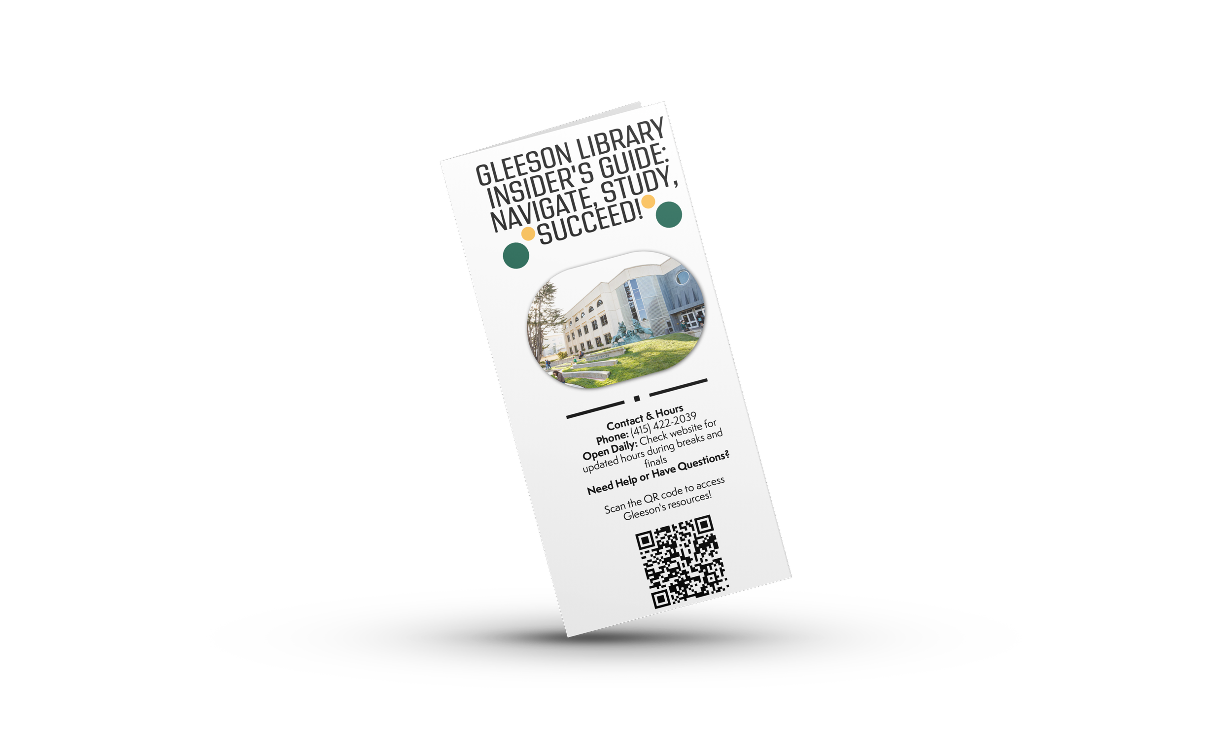
Gleeson Library INSIDER’S GUIDE: NAVIGATE, STUDY, SUCCEED!

I was honored to create the Gleeson Library Pamphlet—a student-eye view of how to navigate Gleeson quickly and confidently. Written in clear, friendly language, it highlights the essentials students actually ask about: where to find study spaces, how to borrow and renew books, printing and tech help, research support, and after-hours access. The goal is practical and welcoming: a pocket guide that helps you spend less time searching and more time studying.
SUMMER- 2025
STUDENT PAMPHLET
ADOBE INDESIGN, ADOBE EXPRESS